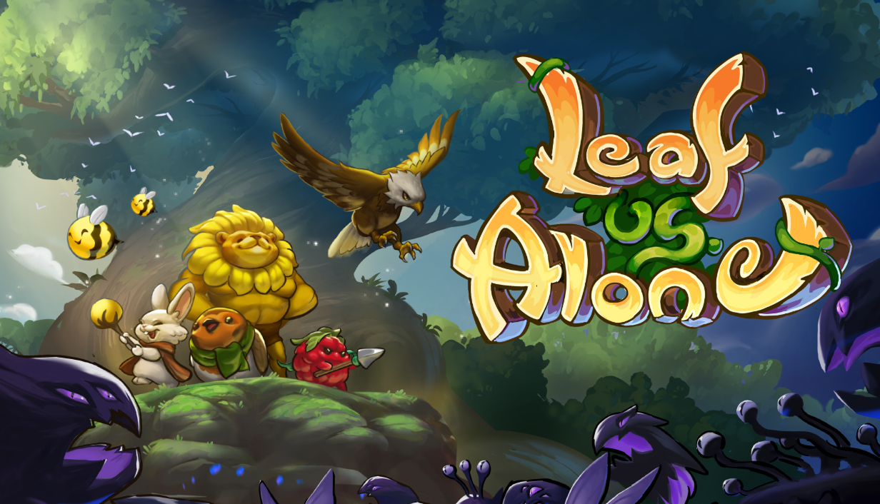
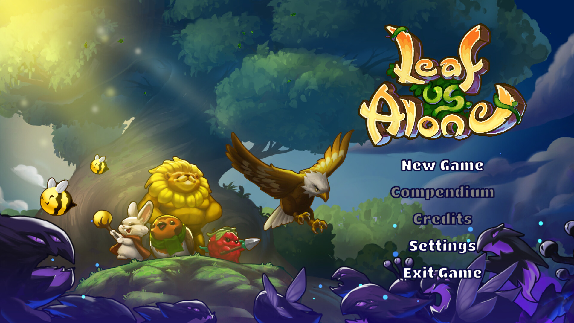
Leaf Us Alone: Initial Encounter

Leaf Us Alone is a turn-based, deck-building, auto-battler with deep strategic play. Build an army of cute yet powerful creatures of the magical forest to defend against the world consuming Voidlings.
Command Your Army In an Unpredictable Battlefield
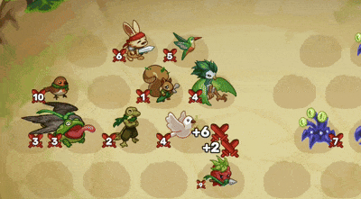
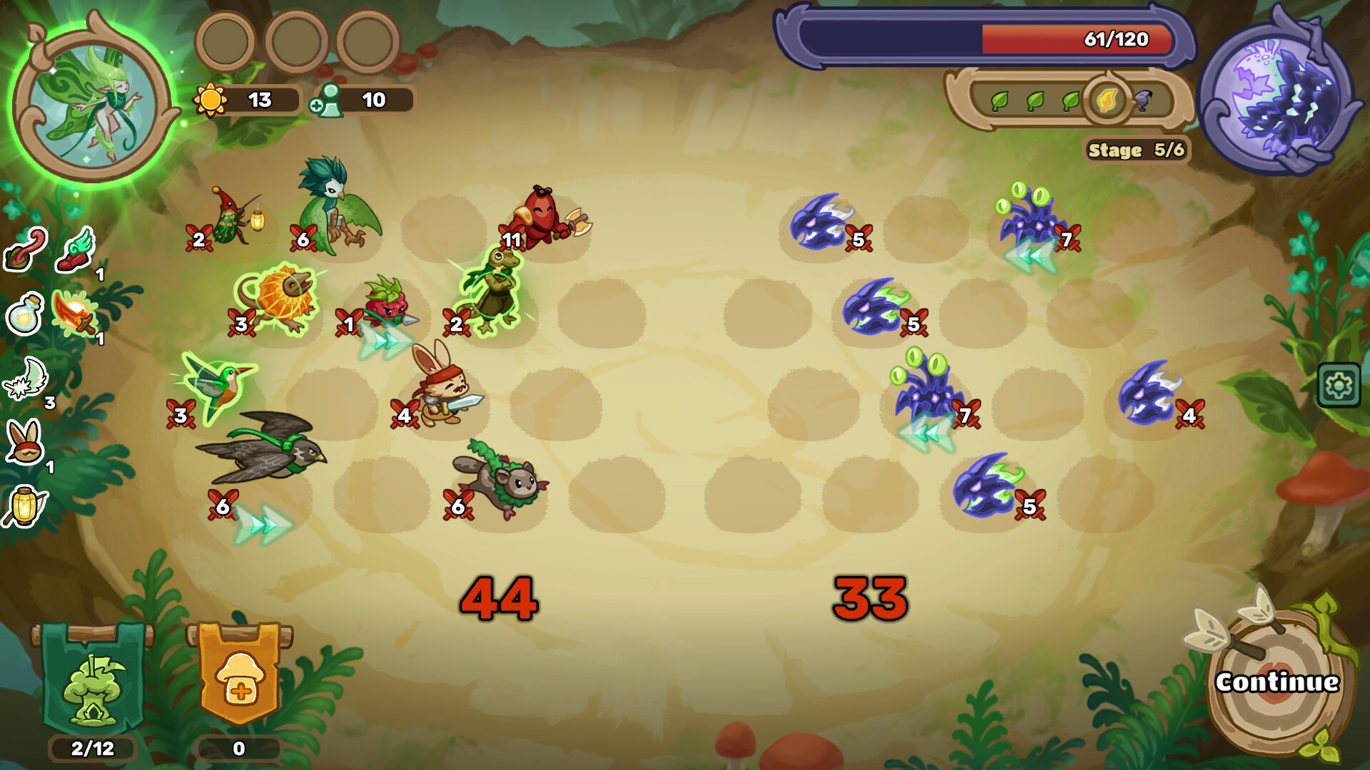
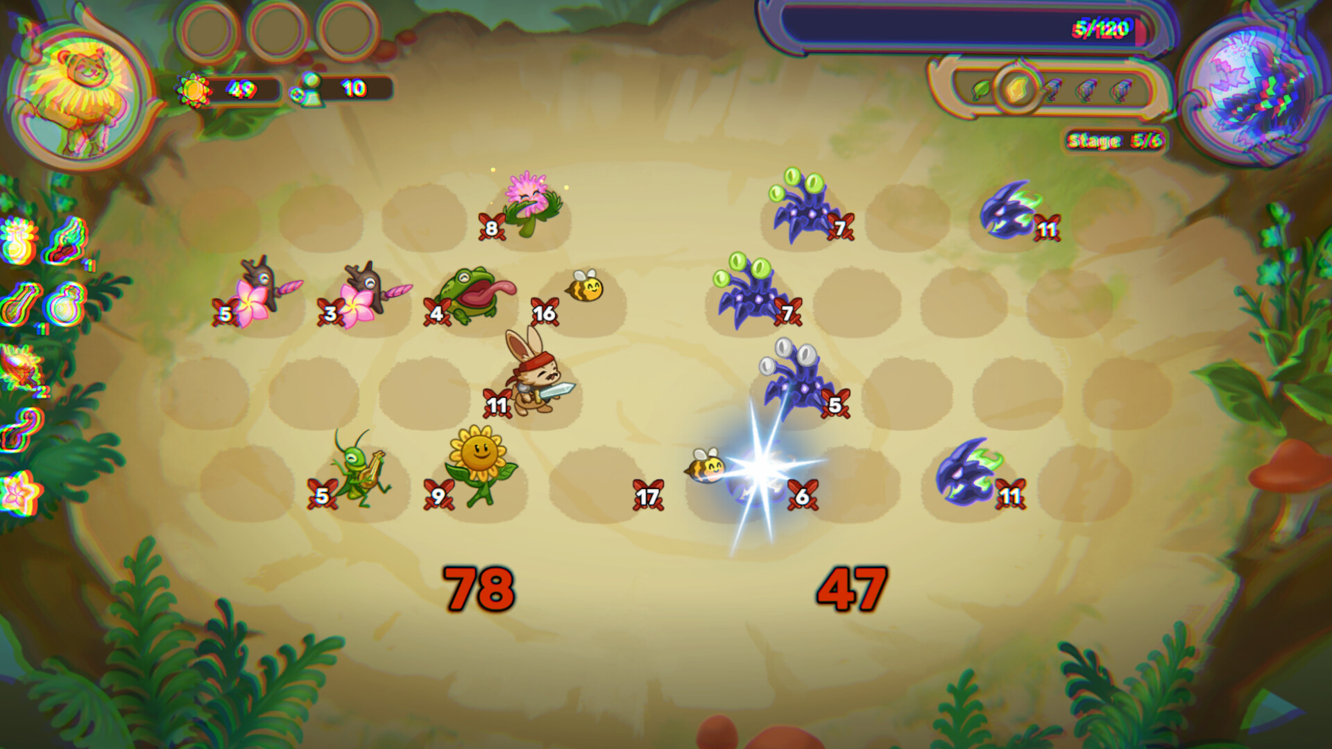
Due to the chaotic nature of war, your army is deployed randomly on the battlefield. However, your strategic commands and clever use of unit abilities can turn the tide of the battle.
Create Combos to Win Duels
Chain crazy combos to strengthen your frontline and destroy the Voidlings in duels. Nothing feels better than watching a perfect plan come together.
Defeat Their Commander
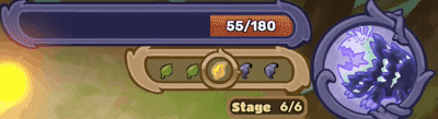
Voidlings are relentless and will keep returning even after being destroyed. The only to stop the onslaught is to take down their commander, but time is not on your side. Fail to act quickly, and the Voidlings will consume beyond the World Tree's power to regenerate.

This is an early development build. The following features will be added in future version:
- Boss mechanics
- Ascension/Difficulty increment
- Progression to unlock more units and relics


Download
Comments
Log in with itch.io to leave a comment.
You were asking for play-testers, so here goes.
Who am I? Game developer by profession and hobby. I don't usually play auto-battlers, but I do enjoy strategy games.
First impressions (store page and trailer):
Your presentation and trailer are very nice. I like that you jump directly into gameplay. My first impression is that it's a mobile game, or heavily inspired by the style of mobile games. Art, juice, SFX, and especially the UI give me this impression. Nits: You have two screenshots (side-bar) and two screenshots (main page), along with first frame of the trailer that are all showing very similar backgrounds (beige). I wonder how feasible it would be to create different environments for the battles to take place? For the close-up screenshots, it would already be enough to color-grade the ground differently (e.g., one with a more vibrant brown, or gray). Second nit: Word mark is a bit hard to read.
Tutorial:
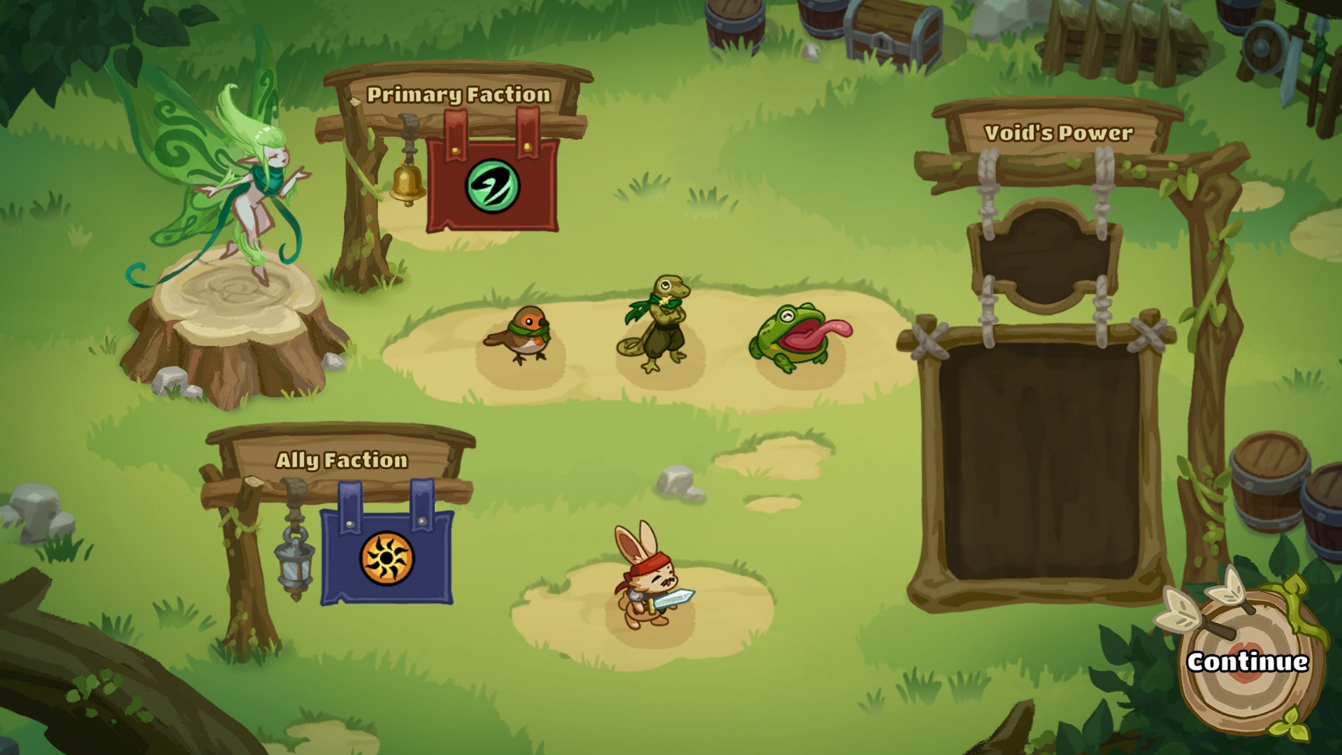
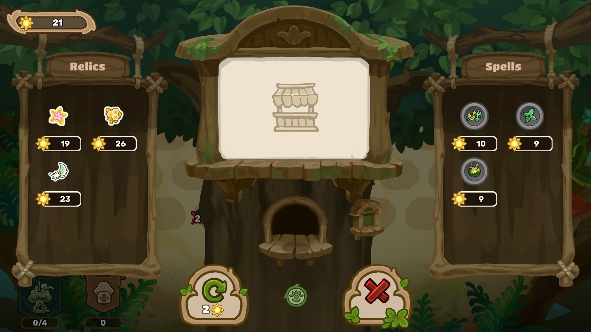
The initial start-page was a bit overwhelming. There was a lot to read (home faction, enemy faction, hero, etc). And it triggered before the tutorial. I think maybe for the first play, you could try to guide the player through this page faster. It might be enough to have a flashing arrow pointing to the continue button or something similar. I spent time on this page that wasn't necessary, because directly afterwards the tutorial started. The rest of the tutorial was very good. I liked how you triggered tutorial pages as-needed (e.g., before the shop) instead of giving the player a ton to read up-front.
Gameplay impressions:
The basic game concept was fun, and easy to understand. I was surprised that there wasn't anything similar to pass-through damage (I mean, if an enemy was in a row un-opposed, it just didn't do anything?). As a player, I felt motivated to make sure my people didn't die, but I didn't feel motivated to min-max my total damage. I would often ensure that my people were either in rows un-opposed (seems my total damage was always higher than theirs?), or ensure I had at least tied their damage in each row. In the play-through, I lost one unit in wave 9 due to a miscalculation.
In general the gameplay was a tiny bit shallower than I hoped. I would at least consider whether passthrough damage (e.g., Inscryption style) would fit into the game.
Nits:
Thank you very much for test out the game. Your feedback has been very helpful and will be taken into consideration for the upcoming update.
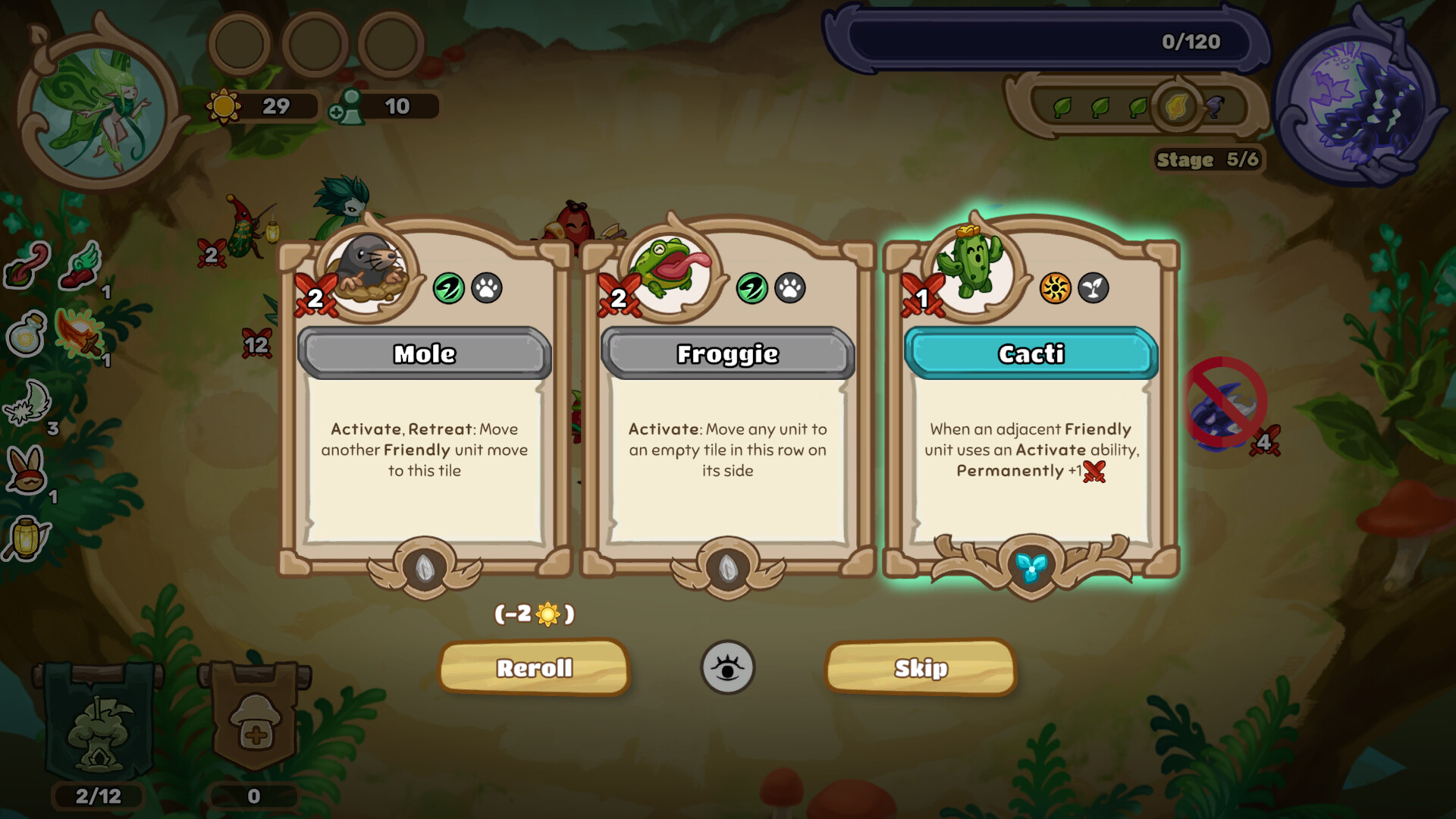
As for the reposition twice, it is actually showed via the color border of the activation. Gold = can use more than once, green = can use once.